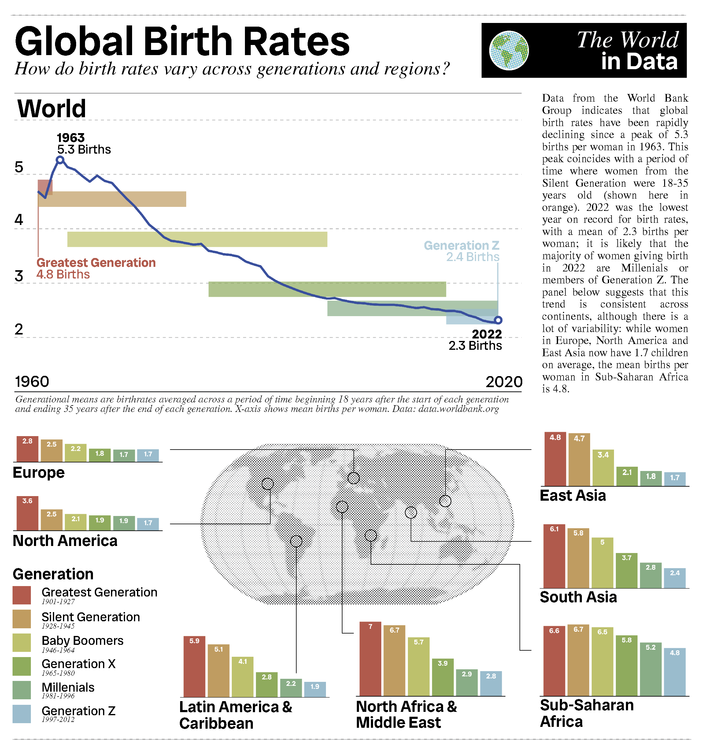
To get better at Adobe Illustrator I wanted to try and make a graphic displaying birth rate data from 1958-2023, grouped across generations and continents. To do this I first downloaded some data from data.worldbank.org!
First I want to read in the data and select which regions I want to look at.
# Libraries
library(tidyverse)

# Data
setwd('/Users/alicesmail/Desktop/BirthRatesGraphic')
BirthRates <- read.csv('BirthRates.csv') %>%
  column_to_rownames('Country.Name') %>%
  t() %>% as.data.frame()

# Get world and continents
BirthRatesSub <- BirthRates %>%
  select('World', 'North America', 'Latin America & Caribbean',
         'Middle East & North Africa', 'East Asia & Pacific',
         'Europe & Central Asia', 'South Asia', 'Sub-Saharan Africa') %>%
  t() %>% as.data.frame() %>%
  select(-c('Country.Code', 'Indicator.Name', 'Indicator.Code', 'X2023')) %>% rownames_to_column('Area')
Here is what the data looks like:
head(BirthRatesSub[1:6])## Area X1960 X1961 X1962 X1963 X1964
## 1 World 4.689982 4.568920 5.028700 5.317398 5.134354
## 2 North America 3.668108 3.631992 3.480898 3.345155 3.214264
## 3 Latin America & Caribbean 5.866961 5.859832 5.846589 5.822483 5.764629
## 4 Middle East & North Africa 6.942146 6.969808 7.046952 7.026845 7.001577
## 5 East Asia & Pacific 4.558312 4.165134 5.533838 6.393202 5.868460
## 6 Europe & Central Asia 2.836412 2.829071 2.807076 2.802485 2.792361Next I just want to remove the ‘X’ from the column headers. Then I make the data ‘longer’ so that it is suitable for ggplot.
# Gsub
colnames(BirthRatesSub) <- gsub('X', '', colnames(BirthRatesSub))

# Longer
BirthRatesSubLonger <- BirthRatesSub %>% pivot_longer(cols=-Area, names_to='Year', values_to='Birth Rate')

# Making sure the data is numeric
BirthRatesSubLonger$`Birth Rate` <- as.double(BirthRatesSubLonger$`Birth Rate`)
BirthRatesSubLonger$Year <- as.double(BirthRatesSubLonger$Year)
Here is what the data looks like now:
head(BirthRatesSubLonger)## # A tibble: 6 × 3
## Area Year `Birth Rate`
## <chr> <dbl> <dbl>
## 1 World 1960 4.69
## 2 World 1961 4.57
## 3 World 1962 5.03
## 4 World 1963 5.32
## 5 World 1964 5.13
## 6 World 1965 5.09In order to look at generational changes in birth rate I need to get the starts and ends of each generation. To get a range of years that represent ‘childbearing’ years for each generation, I added 18 to the start year and 35 to the end year of each generation.
# Make generation dataframe
GenerationPeriods <- data.frame(Generation=c('Greatest Generation', 'Silent Generation',
                                             'Baby Boomers', 'Generation X', 'Millennials', 'Generation Z'),
                                Start=c(1901+18, 1928+18, 1946+18, 1965+18, 1981+18, 1997+18),
                                End=c(1927+35, 1945+35, 1964+35, 1980+35, 1996+35, 2012+35))

# Edit so starts are at least 1960
GenerationPeriods$Start[1:2] <- 1960
GenerationPeriods$End[5:6] <- 2022Now I have this data, I can plot the global birth rate as a line graph. I have added generational averages (mean birthrate across the ‘childbearing’ years for each generation), using geom_segment.
# World data
World <- BirthRatesSubLonger%>%filter(Area=='World')

# Get mean birthrate for each generation
for (i in 1:6){
  GenerationPeriods$MeanBR[i] <- mean((World%>%filter(Year>=GenerationPeriods$Start[i],
                                                      Year<=GenerationPeriods$End[i]))$`Birth Rate`)
}

# Palette
palette <- list(colorRampPalette(colors=c('#ba5346', '#cfc963', '#75a450', '#90bdcf'))(6))

# Plot function
PlotGenerations <- function(Data, GenerationPeriods){

  # Plot
  plot<- ggplot()+
    theme_classic()+
    theme(axis.ticks=element_blank(),
          axis.text.x=element_blank(),
          axis.text.y=element_blank(),
          axis.line.y=element_blank(),
          panel.grid=element_blank(),
          panel.border=element_blank(),
          text=element_text(family='Radio Canada Big', size=16, face='plain'),
          panel.grid.major.y = element_line(colour="grey", size=0.5, linetype='dashed'),
          plot.title=element_text(family='Radio Canada Big', face='bold', size=30, vjust=-11, hjust=1),
          plot.margin = unit(c(0, 0, 0, 0), "null"),
          panel.spacing = unit(c(0, 0, 0, 0), "null")) +
    scale_x_continuous(n.breaks=2, limits=c(1960, 2022), expand=c(0.05,0.05))+
    scale_y_continuous(limits=c(1,6.5), expand=c(0,0))+
    geom_segment(data=GenerationPeriods,
                 aes(x=Start, y=MeanBR, xend=End, yend=MeanBR, colour=Generation),
                 linewidth=10, alpha=0.7)+
    scale_colour_manual(values=palette[[1]], breaks=c('Greatest Generation', 'Silent Generation',
                                                      'Baby Boomers', 'Generation X', 'Millennials', 'Generation Z'))+
    geom_line(data=Data, aes(x=Year, y=`Birth Rate`, group=Area), linewidth=1.5, colour='#274bb0')+
    guides(colour='none')+
    labs(x='', y='')+
    geom_point(data=Data%>%filter(`Birth Rate`==max(Data$`Birth Rate`)),
               aes(x=Year, y=`Birth Rate`-0.05), size=5, colour='#274bb0')+
    geom_point(data=Data%>%filter(`Birth Rate`==max(Data$`Birth Rate`)),
               aes(x=Year, y=`Birth Rate`-0.05), size=2, colour='white')+
    geom_point(data=Data%>%filter(`Birth Rate`==min(Data$`Birth Rate`)),
               aes(x=Year, y=`Birth Rate`+0.05), size=5, colour='#274bb0')+
    geom_point(data=Data%>%filter(`Birth Rate`==min(Data$`Birth Rate`)),
               aes(x=Year, y=`Birth Rate`+0.05), size=2, colour='white')+
    geom_hline(yintercept=6.5, colour='black')

  # Return
  return(plot)

}


# World data
World <- BirthRatesSubLonger%>%filter(Area=="World")
for (i in 1:6){GenerationPeriods$MeanBR[i] <- mean((World%>%filter(Year>=GenerationPeriods$Start[i],
                                                                   Year<=GenerationPeriods$End[i]))$`Birth Rate`)}
PlotGenerations(World, GenerationPeriods)
Now I can also plot a summary of the mean birth rate for each generation across different continents. Here I have just plotted the data for Sub-Saharan Africa.
# Plot SubSah
PlotGenerationBar <- function(GenerationPeriods){

  # Order x axis
  GenerationPeriods$Generation <- factor(GenerationPeriods$Generation,
                                         levels=c('Greatest Generation', 'Silent Generation',
                                                  'Baby Boomers', 'Generation X',
                                                  'Millennials', 'Generation Z'))

  # Plot
  plot<-ggplot()+
    theme_classic()+
    theme(axis.ticks=element_blank(),
          axis.text.x=element_blank(),
          axis.text.y=element_blank(),
          axis.line.y=element_blank(),
          panel.grid=element_blank(),
          panel.border=element_blank(),
          text=element_text(family='Radio Canada Big', size=16, face='plain'),
          plot.title=element_text(family='Radio Canada Big', face='bold', size=30, vjust=-11, hjust=1),
          plot.margin = unit(c(0, 0, 0, 0), "null"),
          panel.spacing = unit(c(0, 0, 0, 0), "null")) +
    scale_fill_manual(values=palette[[1]], breaks=c('Greatest Generation', 'Silent Generation',
                                                      'Baby Boomers', 'Generation X',
                                                    'Millennials', 'Generation Z'))+
    scale_colour_manual(values=palette[[1]], breaks=c('Greatest Generation', 'Silent Generation',
                                                    'Baby Boomers', 'Generation X',
                                                    'Millennials', 'Generation Z'))+
    guides(fill='none', colour='none')+
    labs(x='', y='')+
    geom_col(data=GenerationPeriods, aes(x=Generation, y=MeanBR, fill=Generation))+
    coord_cartesian(ylim=c(1,8.5))+
    geom_text(data=GenerationPeriods, aes(x=Generation, y=MeanBR-0.4, label=round(MeanBR, 1)),
              colour='white', family='Radio Canada Big', fontface='bold', size=5)


  # Return
  return(plot)

}

# SubSah data
SubSah <- BirthRatesSubLonger%>%filter(Area=="Sub-Saharan Africa")
for (i in 1:6){GenerationPeriods$MeanBR[i] <- mean((SubSah%>%filter(Year>=GenerationPeriods$Start[i],
                                                                    Year<=GenerationPeriods$End[i]))$`Birth Rate`)}
PlotGenerationBar(GenerationPeriods)
Next I take all of these graphs into Adobe Illustrator and put them together in a summary graphic. I have tried to make it as simple as possible; next time I might try to make the colours more professional.