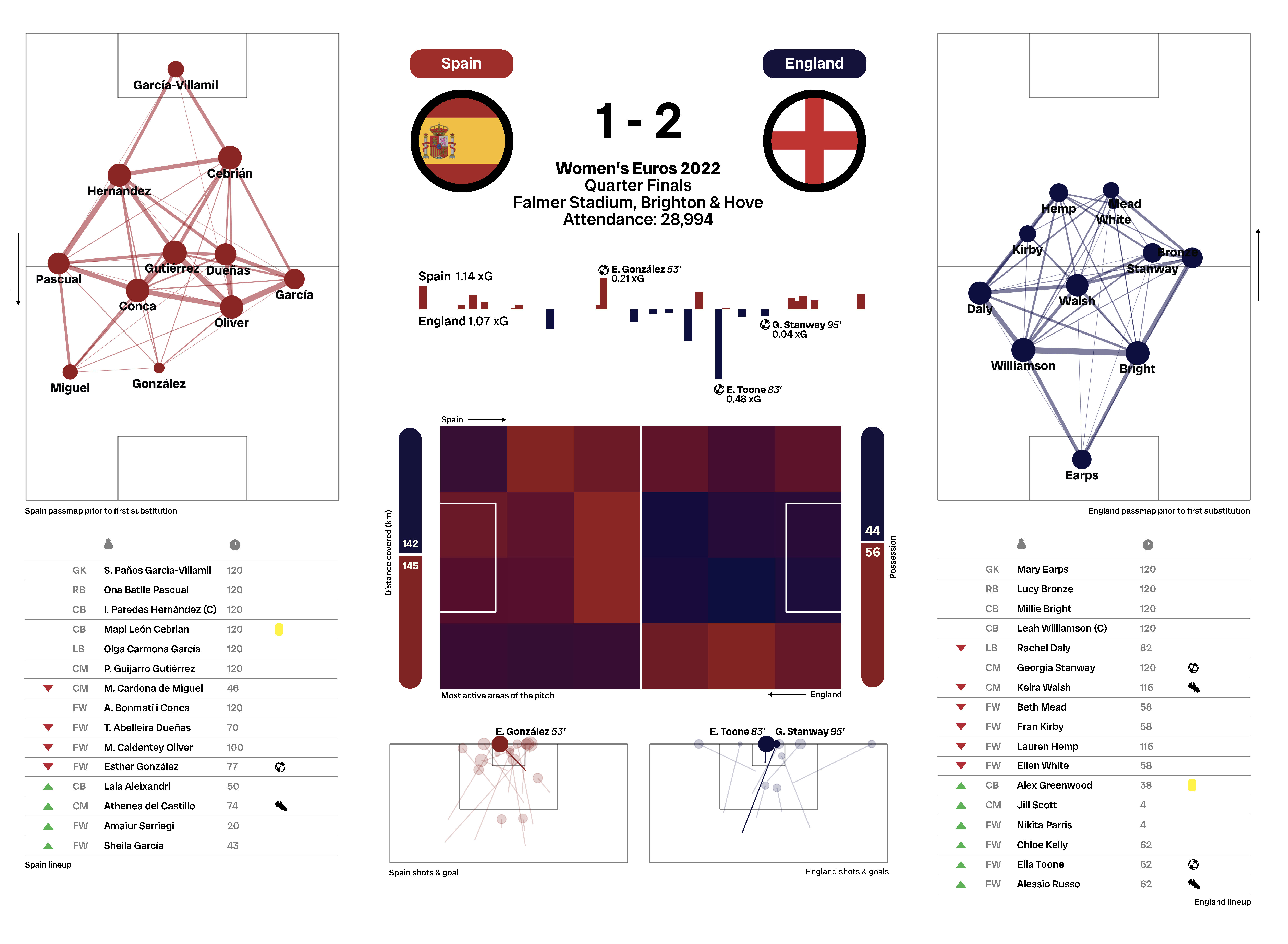
Women's Euros 2022 Quarterfinal
Here I want to make a graphic for the 2022 Women’s Euros
quarter-final match between England and Spain, inspired by The Athletic
Dashboards!
Getting Data
First I downloaded some data using the mplsoccer package using python
as detailed here: https://mplsoccer.readthedocs.io/en/latest/gallery/pitch_plots/plot_scatter.html .
The England-Spain match is event 3844384. I obtained csvs showing
average positions and passing between players on both teams, xG, and an
activity area map.
# Get data
parser = Sbopen()
parser.event(3844384)
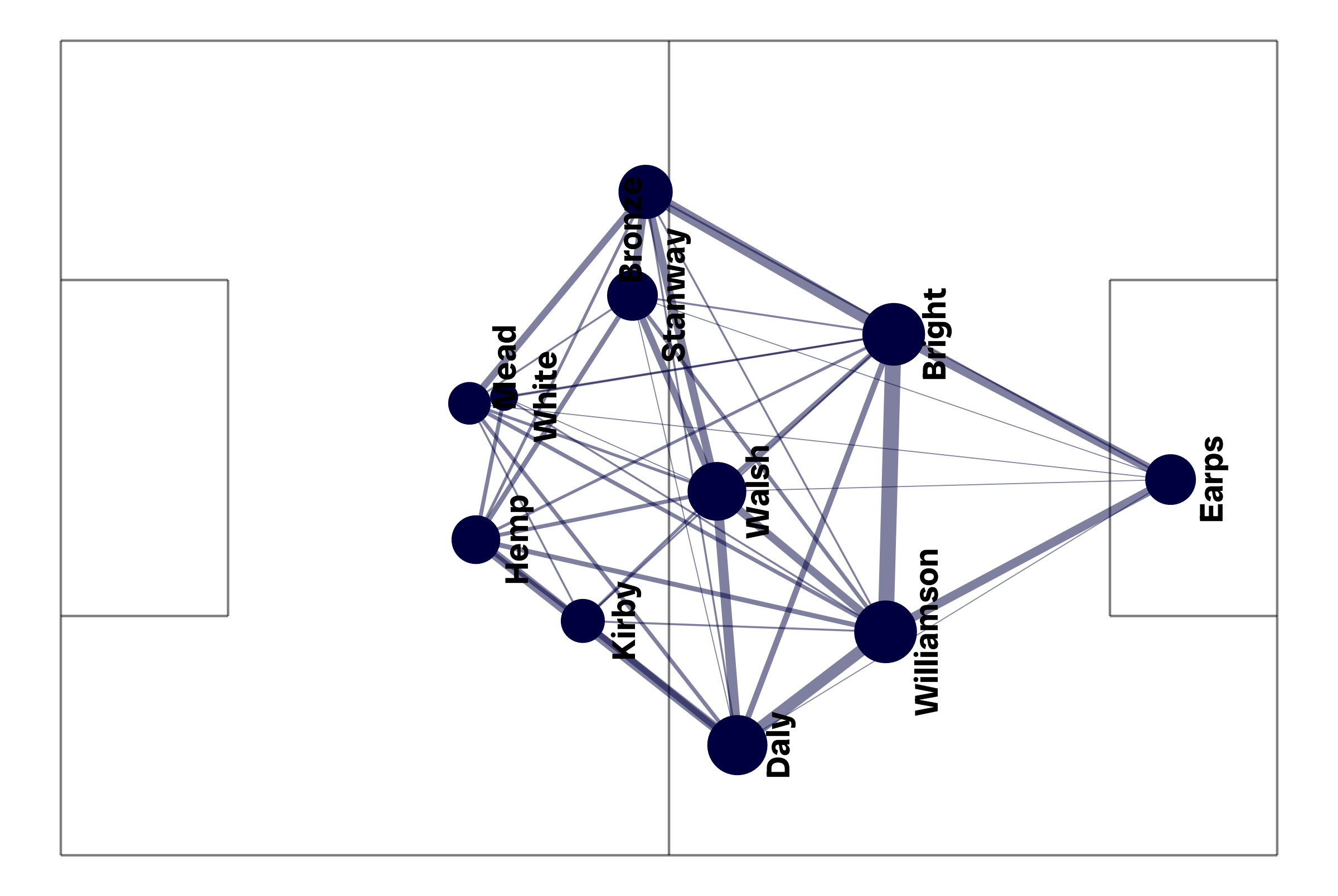
Passing Map
The first thing I want to do is make a passing map for England. First
I read in the passmap data I got via mplsoccer into R!
# Packages
library(tidyverse)

# Read data
coords <- read.csv('PassMapCoords-3844384-England.csv')
lines <- read.csv('PassMapPasses-3844384-England.csv')
I also make a function that plots the lines of a football pitch, as
well as the passing coords and arrows.
PassMap <- function(coords, linesCoords, colour1, colour2){

  # Plot
  plot <- ggplot(coords, aes(x=x, y=80-y, size=no, label=player_name))+

    # Pitch
    annotate(geom='segment', x=c(0,0), xend=c(120,120), y=c(0,80), yend=c(0,80), alpha=0.5, colour = "black")+
    annotate(geom='segment', x=c(0,120), xend=c(0,120), y=c(0,0), yend=c(80,80), alpha=0.5, colour = "black")+

    # Penalty areas
    annotate(geom='segment', x=16.5, xend=16.5, y=80/2+16.5, yend=80/2-16.5, alpha=0.5, colour = "black")+
    annotate(geom='segment', x=0, xend=16.5, y=80/2+16.5, yend=80/2+16.5, alpha=0.5, colour = "black")+
    annotate(geom='segment', x=0, xend=16.5, y=80/2-16.5, yend=80/2-16.5, alpha=0.5, colour = "black")+
    annotate(geom='segment', x=120-16.5, xend=120-16.5, y=80/2+16.5, yend=80/2-16.5, alpha=0.5, colour = "black")+
    annotate(geom='segment', x=120, xend=120-16.5, y=80/2+16.5, yend=80/2+16.5, alpha=0.5, colour = "black")+
    annotate(geom='segment', x=120, xend=120-16.5, y=80/2-16.5, yend=80/2-16.5, alpha=0.5, colour = "black")+

    # Centre
    annotate(geom='segment', x=120/2, xend=120/2, y=0, yend=80, alpha=0.5, colour = "black")+

    # Lines
    annotate(geom='segment', x=linesCoords$x.x, xend=linesCoords$x.y,
             y=80-linesCoords$y.x, yend=80-linesCoords$y.y, size=linesCoords$pass_count/5,
             colour=colour1, alpha=0.5, colour = "black")+


    # Points
    geom_point(colour=colour1, alpha=1)+

    # Details
    ggrepel::geom_text_repel(size=5, family='Radio Canada Big', fontface='bold',
                             max.overlaps=Inf, colour=colour2, vjust=2.35, min.segment.length=1, angle = 90)+
    guides(size='none')+
    scale_size(range=c(5,12))+
    theme_void()+
    theme(text=element_text(family='Radio Canada Big', size=15),
          plot.background=element_rect(fill='#ffffff', colour='#ffffff'),
          panel.background=element_rect(fill='#ffffff', colour='#ffffff'),
          legend.background=element_rect(fill='#ffffff'),
          plot.title=element_text(hjust=0.5, face='bold', size=20),
          plot.subtitle=element_text(hjust=0.5, size=12),
          panel.border = element_blank())

  return(plot)

}
I then clean the data and use my function to plot the passing map for
England:
# Modify
coords$x=120-coords$x
coords$y=80-coords$y

# Get pass lines
lines <- lines %>% separate_wider_delim(pair_key, delim="_", names=c("Player1", "Player2"))
linesCoords <- merge(lines, coords, by.x='Player1', by.y='player_name')
linesCoords <- merge(linesCoords, coords, by.x='Player2', by.y='player_name')

# Plot
EnglandPasses <- PassMap(coords, linesCoords, '#000040', 'black')
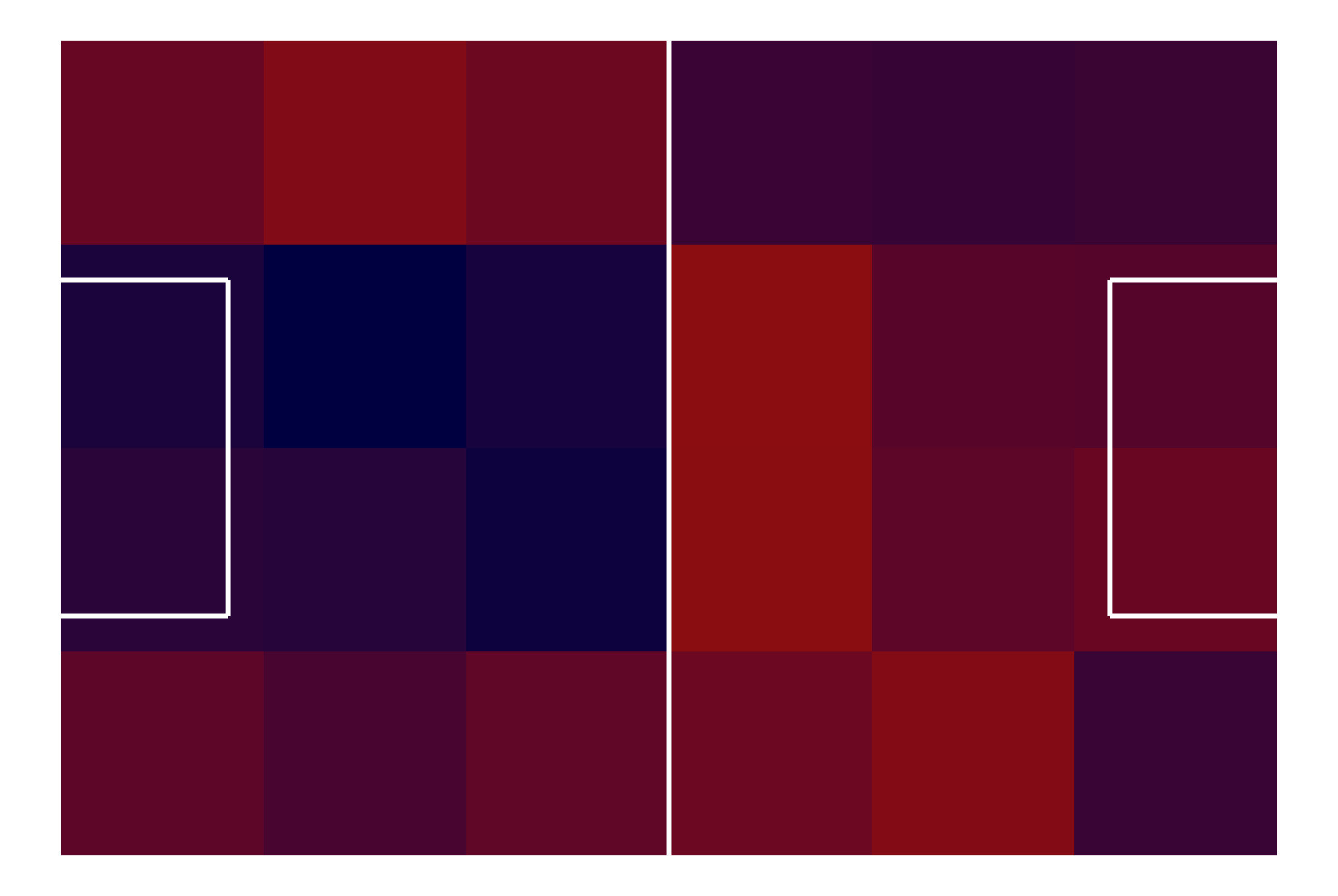
Activity Heatmap
I also want to make a heatmap showing the active areas of the pitch
for each team. Here I also plot the lines of the football pitch:
# Get data
areamap <- read.csv('AreaMap-3844384.csv', row.names='X') %>%
  t() %>% as.data.frame() %>% rownames_to_column('Area')
areamap$Area <- gsub('X', '', areamap$Area)
areamap <- areamap%>% separate_wider_delim(Area, delim="_", names=c("x", "y"))

# Heatmap
ggplot(areamap, aes(x=as.numeric(y)-10, y=as.numeric(x)-10, fill=Difference)) +
  geom_tile()+
  scale_fill_gradientn(colours=c('#8B0D11','#000040'), breaks=c(-100,100))+
  theme_void()+
  guides(fill='none')+

  # Penalty areas
  annotate(geom='segment', x=16.5, xend=16.5, y=80/2+16.5, yend=80/2-16.5, alpha=1, colour='#ffffff', size=1)+
  annotate(geom='segment', x=0, xend=16.5, y=80/2+16.5, yend=80/2+16.5, alpha=1, colour='#ffffff', size=1)+
  annotate(geom='segment', x=0, xend=16.5, y=80/2-16.5, yend=80/2-16.5, alpha=1, colour='#ffffff', size=1)+
  annotate(geom='segment', x=120-16.5, xend=120-16.5, y=80/2+16.5, yend=80/2-16.5, alpha=1, colour='#ffffff', size=1)+
  annotate(geom='segment', x=120, xend=120-16.5, y=80/2+16.5, yend=80/2+16.5, alpha=1, colour='#ffffff', size=1)+
  annotate(geom='segment', x=120, xend=120-16.5, y=80/2-16.5, yend=80/2-16.5, alpha=1, colour='#ffffff', size=1)+

  # Centre
  annotate(geom='segment', x=120/2, xend=120/2, y=0, yend=80, alpha=1, colour='#ffffff', size=1)
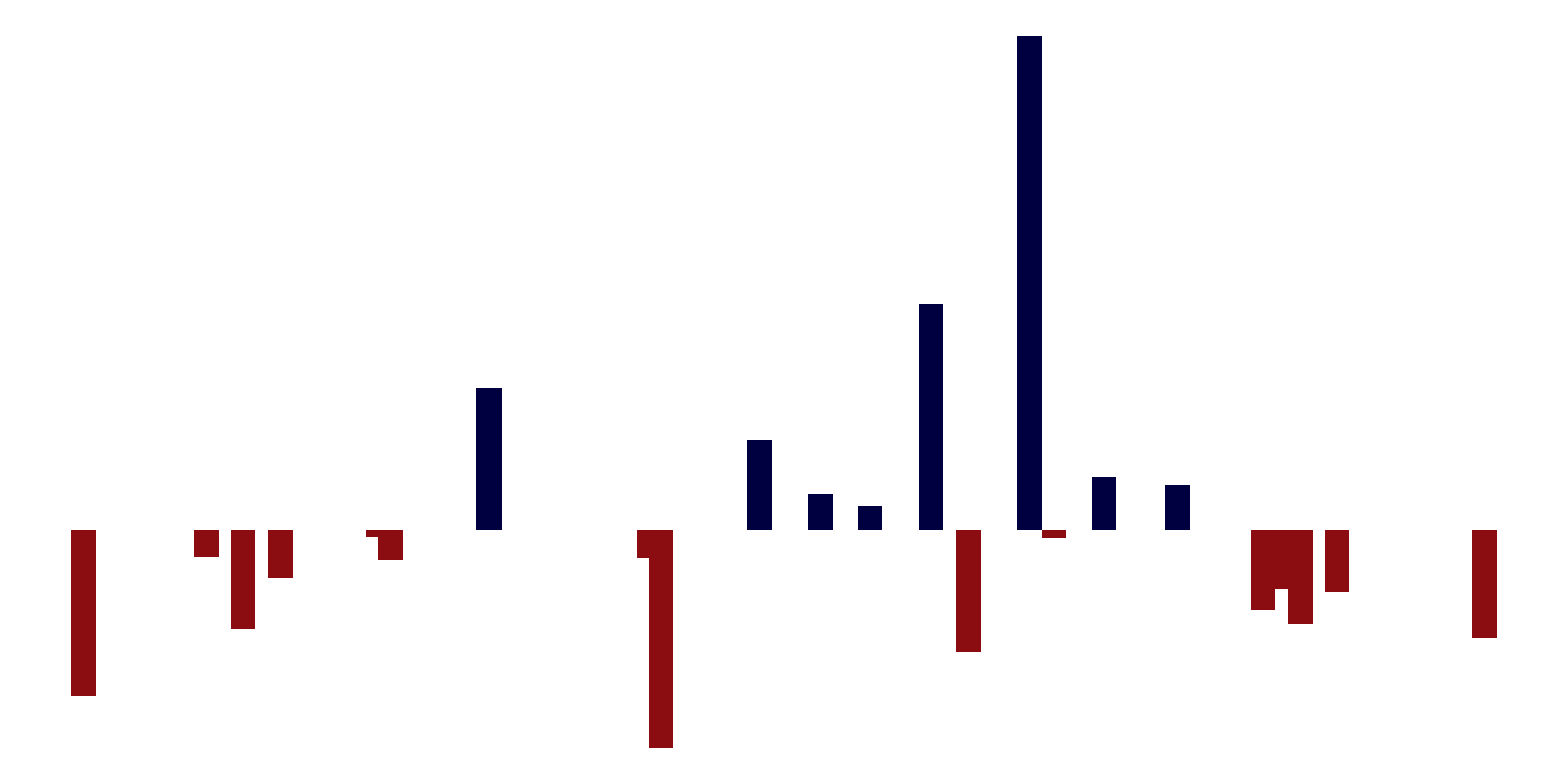
xG Plot
Finally I want to make a simple bar plot showing xG across the 120
minutes played:
# Get data
xG <- read.csv('xG-3844384.csv')

# Cumulative xG
xG$cum_sum_team <- ave(xG$shot_statsbomb_xg, xG$team_name, FUN=cumsum) - xG$shot_statsbomb_xg
xG$cum_sum_team_actual <- ave(xG$shot_statsbomb_xg, xG$team_name, FUN=cumsum)
xG$cum_sum_all <- ave(xG$shot_statsbomb_xg, FUN=cumsum) - xG$shot_statsbomb_xg
xG$cum_sum_otherteam <- xG$cum_sum_all-xG$cum_sum_team

# Line plot
ggplot(xG %>% mutate(shot_statsbomb_xg=ifelse(team_name=="Spain Women's", (xG$shot_statsbomb_xg*-1), xG$shot_statsbomb_xg)), aes(x=minute, y=shot_statsbomb_xg, fill=team_name))+
  geom_col(width=2)+
  theme_void()+
  theme(text=element_text(family='Radio Canada Big', size=15),
        plot.background=element_rect(fill='#ffffff', colour='#ffffff'),
        panel.background=element_rect(fill='#ffffff', colour='#ffffff'),
        legend.background=element_rect(fill='#ffffff'),
        plot.title=element_text(hjust=0.5, face='bold', size=20),
        plot.subtitle=element_text(hjust=0.5, size=12),
        panel.border = element_blank())+
  scale_fill_manual(values=c('#000040','#8B0D11'))+
  guides(fill='none')
Making a Graphic
With all of these plots for both England and Spain I then made a
graphic in Adobe Illustrator: